The LA Clippers have undergone several changes throughout their history. From changing the name of the franchise twice to a controversial relocation, the Clippers had their fair share of makeovers.
Now the franchise has undergone another change which will be effective from the 2024-25 season. The identity of the franchise remains the same but only a fresh look has been applied. These changes have been made bearing specifics in mind, at least as per the team owner, Steve Ballmer.
Why did Clippers rebrand their logo and jerseys for next season?
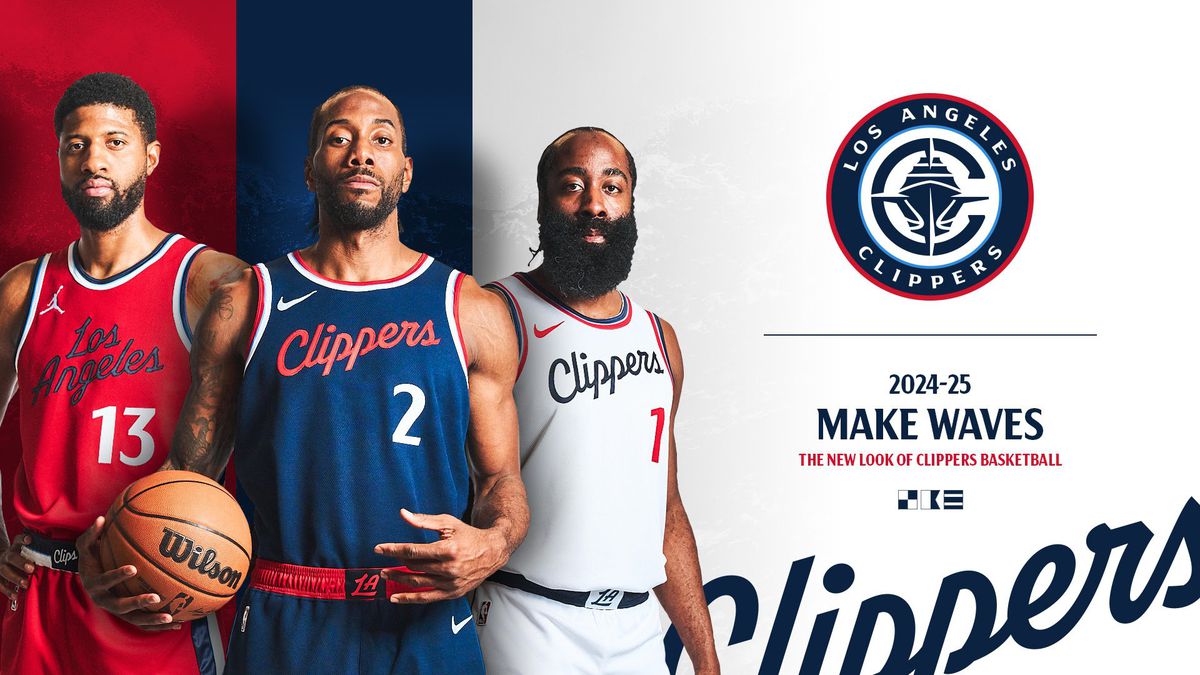
Ever since the arrival of the new owner, Steve Ballmer, the Clippers have focused on every aspect from the home court to the logo and even the name of the franchise. On Monday, they unveiled their new logo along with three jerseys.
The Clippers unveil new jerseys and logo for next season 🔥
— Bleacher Report (@BleacherReport) February 26, 2024
(via @LAClippers) pic.twitter.com/HVHVmYlQk8
The name Clippers was originally settled from a local naming contest as the city is well known for great sailing ships. The new logo has the Clippers “C” surrounding a ship with the team’s full name written in the outer circle, while the previous logo had the curved lines symbolizing the ocean’s horizon with “LA” written inside and a giant “C” hugging them.
The logos are symbols that tells a story about the franchises and help in identifying them, which the fresh design does well. After listening to the fans, the franchise introduced their new jerseys with the idea to mingle their past and future. The red jersey made a comeback after the 2015-2017 collection as the fans missed it. The transformation focuses on how their basketball is proceeding towards a new beginning.
We’ll be entering @IntuitDome with a new logo as well!
— LA Clippers (@LAClippers) February 26, 2024
Here's the breakdown ⤵️ pic.twitter.com/QgUXlvNYsN
Ballmer had plans to change the name of the franchise but as per his unit’s survey. the fans were against the name changing. “The focus groups are advisory, not definitive,” the former CEO of Microsoft said.
“But I still listen to them, and I have heard, partially to my surprise, that there is no interest in a name change. I had thought about [the name] years ago, before I got the team, but we heard similar reactions back then.”
In the last couple of years, the Clippers have gained almost double the numbers of fans, as per reports. They do not want the numbers to stop, and a Championship win could easily boost it.
Everyone thinks the same on Clippers’ new logo and jerseys
The new logo and jerseys are making waves on the internet after the franchise’s announcement. The NBA community reacted to the rebranding. While they seemed satisfied with the three unique jerseys, the logo was not something they were thrilled to see. Here are some of the reactions of the NBA fans on X (colloquially known as Twitter):
“The Jerseys are simple, but not awful. That logo kinda wack tho”
The Jerseys are simple, but not awful. That logo kinda wack tho
— 𝙃𝙀𝘼𝙏 𝙉𝘼𝙏𝙄𝙊𝙉 (@HeatvsHaters) February 26, 2024
“Logo probably won’t get much love, but it is unique, has some character and not a plain minimalist logo like every other team is trying to do”
Logo probably won’t get much love, but it is unique, has some character and not a plain minimalist logo like every other team is trying to do
— Parker’s Picks (@parkers_pickss) February 26, 2024
“The jerseys are absolute FIRE (fire emoji) and super elegant, but the logo will change in 3 years.”
The jerseys are absolute FIRE 🔥 and super elegant, but the logo will change in 3 years.
— Juan (@JuanIsidro) February 26, 2024
“What is that logo lol?”
What is that logo lol?
— Austin 🦆 (@deviousduck_) February 26, 2024
“These actually aren’t that bad. Minimalistic yet easily differentiated.
The C logo though confuses me lol not feeling that entirely”
These actually aren't that bad. Minimalistic yet easily differentiated.
— ZACK! (@I_Am_Zackk) February 26, 2024
The C logo though confuses me lol not feeling that entirely
“I like the unis but I have no idea what that logo is (laughing emoji)”
I like the unis but I have no idea what that logo is 😂
— Boothe Bets (@BootheBets) February 26, 2024
The franchise will be seen playing in their new home, Intuit Dome in Inglewood in the 2024-2025 season which will also host the NBA All-Star weekend in 2026. The new logo, jerseys and home court suggests that Ballmer is prepared to do everything to bring home the first NBA Championship title for the LA Clippers.